

Brief: I was tasked with creating an urban sneaker brand after to complement my basketball shoe.

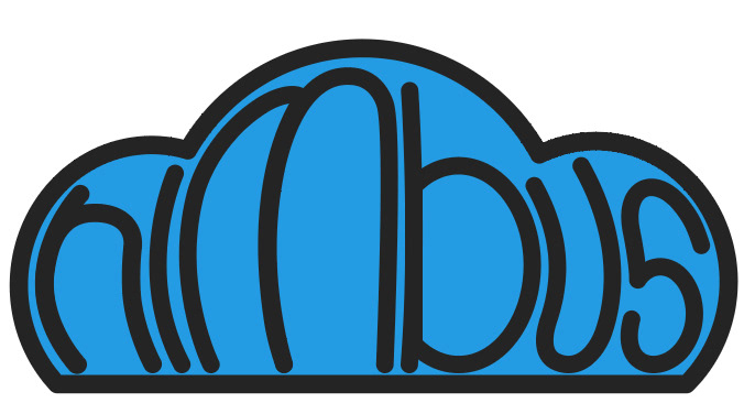
Sketches: My sketches were heavily based on nimbus clouds. I wanted my brand to stick with the cloud theme of my initial shoe, and as a result, I named it Nimbus. With this logo, I approached it simply, making it a cloud, but as I worked on it, I decided to experiment with the typography.

The Final Concept: In the final concept, I used the title of the brand to make up the shape of the cloud. I also utilized a similar blue to the color of the shoe


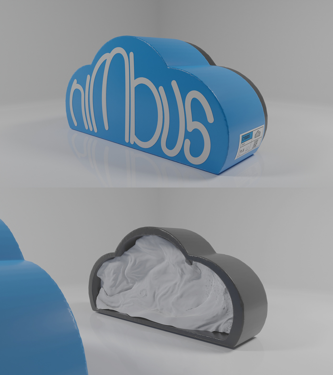
Packaging Development: After finalizing the logo, I wanted to create packaging that was both unique and practical. Typically, shoe boxes are very static and don't do much very different from one another. In my approach, I chose to make a box that is different from the norm in its shape, making it stand out from competitors on the shelf. After the sketches, I modeled my packaging on my iPad, and rendered it in Blender.
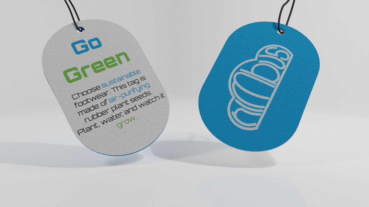
Additional Brand Tag: Continuing with the approach of atypical branding, I created a plantable brand tag. These kinds of tags aren't very common, but they have the potential for widespread ecological benefits. The creation of shoes is very taxing on the environment, so to try and mitigate my brand's ecological footprint, I chose to produce these tags.
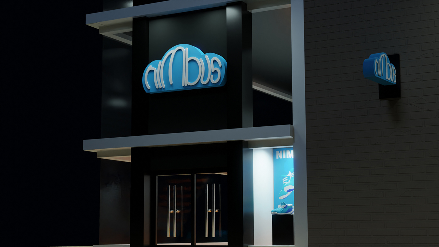
Storefront: The finishing touch on this project was a storefront. I felt like trying my hand at architecture, so that I could fully flesh out the brand.


